The Psychology Behind an Effective Pricing Page
It’s the moment of truth. Your prospect has stuck around on your site long enough to consider subscribing to your service. The intent is there. But intent is not the same as action.
This is where your pricing page comes in. Does it have what it takes to convert that intent into an actual subscription? Is your small business website design effective especially the pricing page?
The answer to that question starts with knowing what stage in the buyer’s journey your customers are at when they get to your pricing page. But you won’t get a complete answer until you understand what’s going through their minds.
The Pricing Page in the Buyer’s Journey
The buyer’s journey (more formally known as the customer decision journey) is a marketing framework conceptualized in response to changes in the way consumers research and buy a product or service.
Like the traditional sales funnel, the buyer’s journey maps out the stages a buyer goes through when making a purchase.
What’s different is the belief that touchpoints (those moments when consumers are open to influence) should occur throughout all stages of the journey and not just at the end. In this “new” world, all the tools of marketing – strategy, spending, channels and messages – must align with this journey to reach the consumer with the right message, at the right time, through the right channel.
The stages in the buyer’s journey
1. Discovery/Awareness. The buyer is aware there is a need or problem and is doing background research to better understand and articulate it.
2. Consideration/Evaluation. The buyer has a clear formulation of the problem or need and begins to do research on potential approaches or solutions.
3. Decision/Purchase. The buyer has decided on an approach or solution and compiled a list of the available relevant products or services. He or she is researching these in depth in preparation for making a purchase decision.
4. Retention/Customer Experience/Loyalty. The buyer has purchased a product or service and is using it.
Going back to the buyer’s arrival at your pricing page, it’s clear he or she has reached the Decision stage. It would be more accurate to say, however, that he or she is hovering somewhere between Decision and Retention. The intent to buy is there but the convincing hasn’t happened yet.
It’s easy to see, then, just how crucial this customer touchpoint is, and how equally crucial it is to have an effective pricing page at the ready.
What’s Going Through the Buyer’s Mind?
To understand what’s going through the buyer’s mind as he or she hovers on that tipping point between “buy” and “don’t buy,” it helps to know about the tension principle.
We experience tension when we’re between two things or states: what I don’t have and what I want; what I like and what I don’t like; what’s good and what’s bad. When someone tries to persuade us, we find ourselves in exactly that situation, forced to decide which is the desirable thing and which is the undesirable one.

[IMAGE SOURCE: https://www.flickr.com/photos/deanhochman/16064489288/]
The tension principle says that tension makes us act or moves us to change. That’s because tension makes us feel uncomfortable and we’re forced to do something to reduce that discomfort.
Looked at in this way, it’s easy to see how tension is behind pretty much every persuasion technique available. From there, it’s a short hop to appreciating how pricing pages can play into feelings of tension to convince and convert buyers.
Using the Weapons of Influence
You’re probably already familiar with Robert Cialdini’s six principles of persuasion (also known as the weapons of influence), but it’s still worth looking at them in the context of a pricing page.
There are 2 principles that are especially relevant:
Principle 1: Scarcity
Things are more attractive when they’re harder to get
The scarcity principle says we naturally associate availability with quality: the harder it is to get something, the better it must be. This tendency not only makes us want something, it makes us want it now before it’s gone.
Some of the ways your pricing page can play into scarcity are:
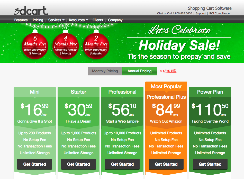
Limit number: Offer a pricing plan discount to the first 25 subscribers.
Limit time: Offer a pricing plan discount for a limited period of time. Here’s an example from 3dcart.
Offer exclusivity: Offer a special pricing plan that’s available only to Beta users.
Principle 2: Social Proof
If lots of people are doing something, it must be okay
The social proof principle says we tend to trust things that are popular or endorsed by people we like or connect with.
Some of the ways your pricing page can use social proof are:
Display testimonials: Include testimonials from known and credible experts in the relevant field.
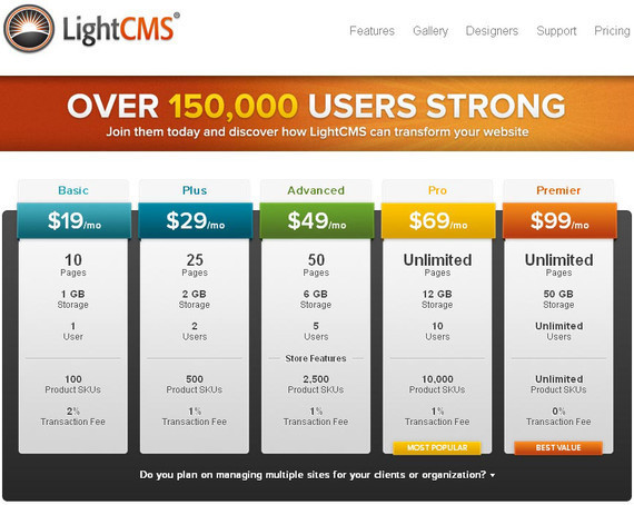
Tell about your existing subscribers: Show the number of your existing subscribers or display a counter showing how many new subscriptions you got that day or week. Here’s an example from LightCMS.
Reducing Friction and Counteracting Objections
I talked about tension being a good thing for conversions. But it can also be a bad thing.
Too much tension can turn into fear and anxiety, which in turn produce doubt. And doubt often leads to objections. These objections are sometimes referred to as friction, which is anything that acts as a barrier to conversion.
1. Reducing friction by counteracting objections
Some of the ways your pricing page can reduce friction are:
Balance urgency with assurance. Write calls to action that create a sense of urgency, but balance that urgency with instruction and assurance. Tell buyers exactly what they’re getting, what they need to do to get it, and what will happen when they subscribe.
Display testimonials, reviews and trust icons. I already talked about displaying testimonials to use social proof. Testimonials, together with reviews and trust icons (logos of your customers), are also a great way to promote trust in your product.
Offer guarantees. One way to allay buyer fears is by making their purchase decision reversible. Offer 30-day free trials as well as monthly subscription plans that can be cancelled any time before the next billing cycle starts.
Ensure privacy and security. Buyers may be wary of subscribing because they worry about what will happen to their personal and payment information. Every website should have a privacy policy with links to it from every page. You can add an extra layer of assurance by reiterating your commitment to privacy on your pricing page and providing an extra link. You should also consider having a page explaining how your site handles security and adding a link to in on the pricing page.
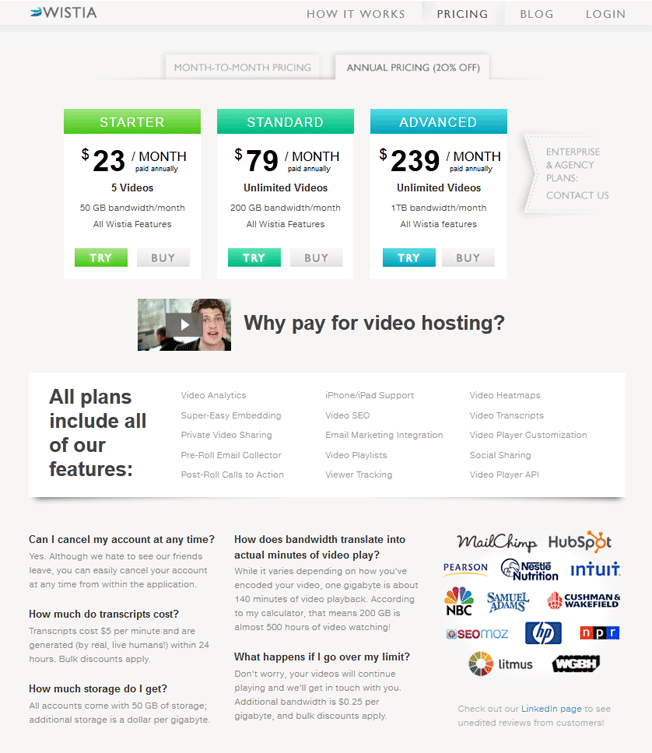
For example, Wistia does a great job of reassuring buyers by displaying trust icons and clearly explaining how their accounts work.
2.Reducing friction by Avoiding the Paradox of Choice
The most famous study to point out the adverse effects of choice is one conducted in 2000 and often referred to as the jam study. The eye-opening results of the study showed that, the more choices a consumer had, the less likely he or she was to end up buying the product.
Further studies supported these findings and, in 2004, the American psychologist Barry Schwartz wrote about this phenomenon in a book entitled The Paradox of Choice. In his book and public talks, Schwartz discusses a number of features characterizing the negative side of choice.
Analysis paralysis. In simple terms, analysis paralysis is the state where overthinking a situation results in no action being taken at all.
Decision fatigue. A related state is decision fatigue, where overthinking doesn’t lead to paralysis, but results in poor decision-making.
Buyer’s remorse. Rounding out this set of features is buyer’s remorse, which is the sense of regret that may come after making a purchase. Not surprisingly, decision fatigue often leads to buyer’s remorse.
Nowhere can the paradox of choice have a more negative effect than on a website’s pricing page.
The last thing you want to happen is for prospective customers to abandon your page because they’re too paralyzed to make a choice. Neither do you want to have unhappy customers who regret their purchase because they think they made the wrong choice.
3.Reducing friction by Using Cognitive Bias Effects to Simplify Choice
The simple answer to avoiding the paradox of choice is to make the buyer’s decision-making process as easy as possible. How to do that is a little bit more complicated.
An obvious approach is to limit choice by limiting the number of pricing plans. But limit to how many?
A typical number is 3, something along the lines of an individual plan, a professional plan and a corporate plan. Often, the individual plan is free.
But there’s really no magic number. A better approach is to do segmented pricing, offering plans that are suitable for different segments of your target audience. If that happens to be 5 segments, so be it.
The key is to present each plan clearly, stating the relevant benefits and using language that resonates with the plan’s target customer.
And that approach takes us onto framing and other cognitive bias effects.
4.Reducing friction by Use framing to get buyers to focus on value instead of cost
The framing effect is an example of cognitive bias where we create meaning from context. People respond to a choice depending on how it is presented or “framed.”
When devising and displaying your pricing plans, use framing to present them as gains rather than losses (i.e., how much the customer will be out of pocket). Focus on the benefits of each plan and sell it based on the value the buyer will get from it (the “more bang for your buck” concept).
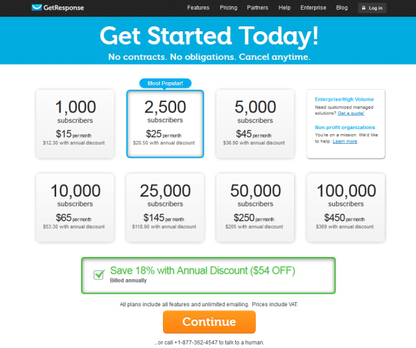
For example, the GetResponse pricing page emphasizes the number of subscribers you can have in each plan as opposed to the plan’s price.
Framing is good to use when you want to optimize comparison of your pricing packages so buyers choose one over another. For example, if you offer a free plan and a premium plan, you can use framing to present the premium plan as a much better value.
A word of warning on using comparative pricing: it can backfire.
A Stanford Business study showed that consumers tend to put more weight on the comparative disadvantages rather than the advantages. That’s because, when being told to make a comparison, people become mistrustful and more risk-averse.
5.Reducing friction by Using anchoring to optimize pricing plan comparison
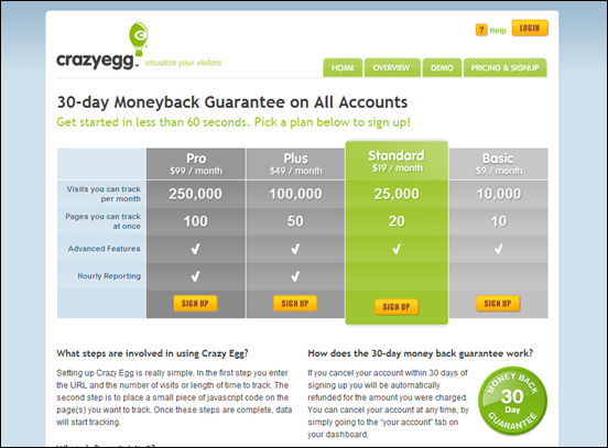
The anchoring effect (also known as focalism) describes how humans tend to rely too heavily on the first piece of information they get (the “anchor”) when making a decision. Once an anchor is set, people make subsequent decisions in relation to it.
In pricing, anchoring occurs when the initial price offered sets the standard for the rest of the negotiation. People see prices lower than the standard as a good deal even if they’re higher than what the item is really worth.
One way of doing that is by displaying the most expensive plan first, like Crazy Egg does here:
By the way, if this sounds familiar, it should. What does everyone tell you when you’re negotiating a salary? Always ask for more than you actually want.
You can easily see how anchoring is a good technique to use to optimize plan comparison on your pricing page. If you offer three plans and you want people to choose the mid-priced one, make the price of the most expensive one really expensive. If anchoring works, buyers will see the mid-priced plan as a great deal.
But remember, as the Stanford Business study showed, pricing comparisons can backfire. As a Fredericksburg web design firm we analyze such things before designing a pricing page.
6. Reducing friction by Using visuals and color to influence choice
So far, all the influence techniques I’ve talked about rely mostly on language (copy). So it’s time to talk about how you can use visuals and color on your pricing page to influence choice.
Use visuals to enhance comprehension and memory
Here are few interesting facts about how our brains process images:
- Our brain processes images 60,000 times faster than text
- 90% of data the brain processes is visual
- we comprehend and remember pictures with text better than text alone
I wouldn’t recommend making your pricing page a “visual” one. However, you can use images judiciously to support its messaging.
For example, you can design images or “logos” for each of your pricing plans that encapsulate characteristics like pricing level and who it’s recommended for.
Other images you can use on your pricing page are logos of your customers. I talked about this earlier in the form of trust icons and how they can engender trust in your product.
7.Reducing friction by using color to enhance recognition
There are many misconceptions about how certain colors produce certain feelings. The truth is that how we react to color is too dependent on personal experience to rely on color association as an influence technique. (For a great discussion on using color in marketing, see Gregory Ciotti’s The Psychology of Color in Marketing and Branding.)
What we can rely on is the ability of color to help us compare and contrast the things we see on the screen. That’s because the first thing humans look for when trying to understand what they’re seeing is contrast.
Hopefully, this behavior immediately makes you think, “CTA buttons!”
Call to action buttons are what makes your pricing page “happen.” That’s because no click, no sale. And if you want buyers to click your CTA button, they have to find it first. Second, they have to know that it’s a button.
This explains why many CTA buttons use bright colors, such as red, that stand out from the page background.
A pricing page, however, with its multiple plan options, has more than one CTA button. So how does contrast work there?
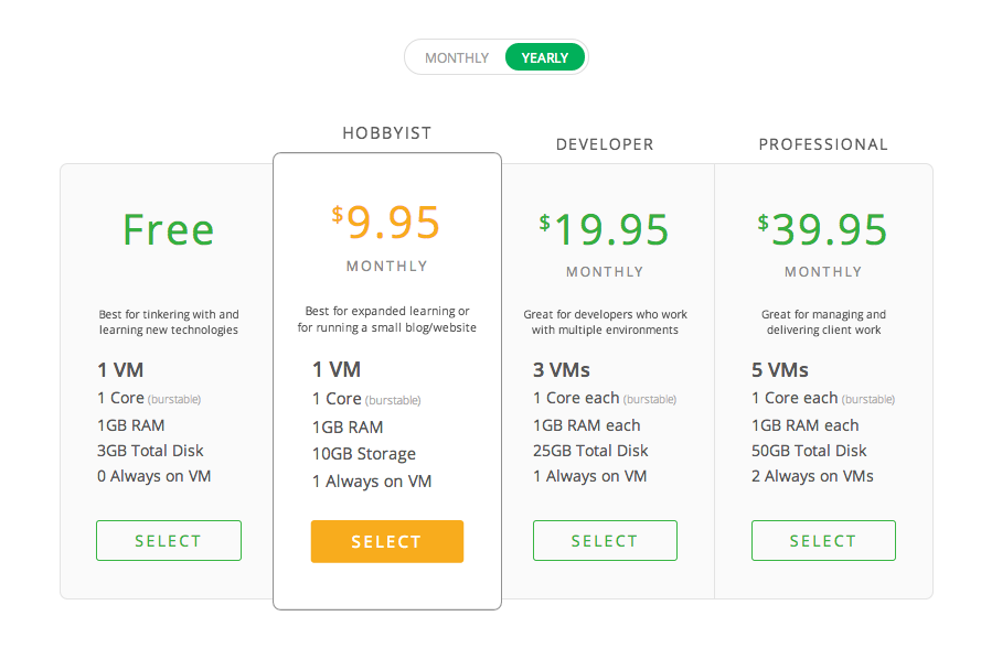
No matter how many CTA buttons there are, you still want them to stand out from the rest of the page and look like buttons. If you’re not trying to influence choice, you can make all the buttons the same color. The important thing is to make them stand out. And for small business website design this is even more important.
If you are influencing choice, you can use a different and brighter color for the CTA button of the preferred plan. Here’s an example from Koding.
There are, of course, many more ways to use human psychology as a tool for creating an effective pricing page. Knowing how to use these starts with a good understanding of what’s going through the buyer’s mind when making that crucial purchase decision.
Note: Please contact us if you need help with ecommerce website design because we can definitely add value to your project with our expertise.


