-

Increase traffic by
200% -

Increase conversion rate by
100% -
increased engagement by
500%
Pain Points
The yoga studio was not attracting many customers online. Of course, Jane’s own clients were very good customers and would do their best to recommend Blue Nectar yoga accessories to their friends. However, the community marketing just wasn’t working . One of the main reasons the store didn’t attract as many customers as Jane would have liked is the second pain point.
The website also didn’t attract many visitors. The Blue Nectar website wasn’t getting many hits, and the business was flourishing off of community marketing, which Jane was very good at. She had tried to do some basic SEO on the website, but there were a lot of other problems the website faced. The website was not mobile responsive and lacked an appealing look geared to appeal to customers in her niche. There was a wide gap being left where the website could have doubled, or even tripled the number of customers Jane was receiving.
The Solution
Short Term Goal
Our short-term goal was to perform some basic SEO on the website. We would work on the main keywords in Jane’s niche and ensure they were well incorporated into the body of the work. Additionally, we would improve the layout of the website so users were likely to stay on the website longer. As it was at the time we began our work, the website looked very dated. With a few changes to the SEO, especially in the blog and store sections, and a better layout, the website would be able to do much better.

Long Term Goal
The long-term goal was to migrate the entire website to WordPress. WordPress had many excellent features that we thought would be a boon to the client’s website. For starters, the themes were practically countless. She could find one that fit her yoga studio perfectly and converted her website visitors better. She would also have full control over her website, including backups, layouts, and security. That would make it easy to create a custom store for her products online and even integrate it with a Shopify add-on if she wanted.

The most important thing with Blue Nectar Yoga’s website was that it would be able to establish credibility with the visitors. They would be able to navigate the website and see as many pictures as possible of happy clients at the studio on various occasions. We wanted the website design to have as many picture galleries as we could fit in and a pleasing aesthetic to draw the visitor in.

Our Approach
Our first step was to come up with a rough wireframe design of the home page, which we showed to the client. She liked most of it at first, but still had to ask for some changes to make it more befitting for the kind of clients she was targeting. We worked on it to come up with a new design, which we then showed her and this time she approved it.
We got down to work once we got the approval. The developers began their work of building the website from scratch and started with the home page, the About Us page, and the store. The Project Coordinator kept working with them to ensure that every feature the client had asked for was included.
Once these key pages were done, the website samples were sent to the client so she could have a look and give her approval. She asked for much fewer changes this time as she liked the work a lot. The changes she asked for were accomplished and sent back quickly, upon which she gave her final approval. The team could now begin coding the website in earnest.
The process remained transparent throughout, with the client being updated on the progress of the website once or twice a week. She was also able to view the building of the website in real time via a special link she had received from the design team. Finally, after the website was ready, we had a meeting with her for a Q&A, and the website was launched soon after. In total, the project took 5 weeks.
The Design
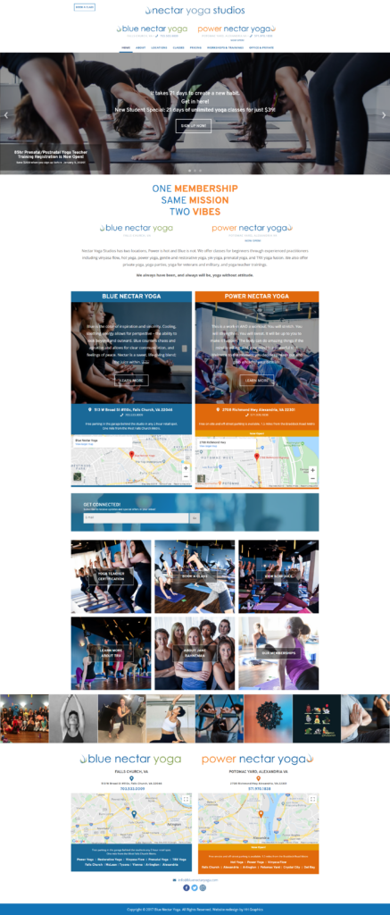
Home

Yoga Sessions

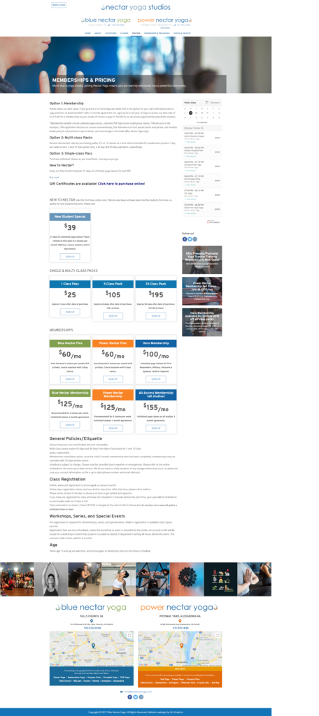
Pricing

